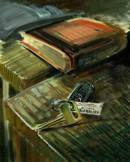
tried "artist's oils" today in corel...I THINK 80 percent of the brushes do the exact same thing but maybe im wrong LOL. anyway it was a good learning experience.. since this brush set has a trail off, and doesnt have size sensitivity :\ i still cant nail the lighting.. his face should glow more orange.. bg should glow a bit too.. have to keep studying how degas makes his image glow. also need to learn how to make objects look like they fade off into the background.. because right now my paintings look super flat. i understand it is a combination of color harmony and edges but it needs lots of practice :\ might take some time to practice painting some still lifes.. because the images on olgas gallery has shitty quality and it only shows me his end product, i need to practice with some raw real life material
oh i didnt finish the bottom half of the image.. so if ur wondering what is wrong with his left hand, hes suppose to have it in his pocket LOL ... watching transformers and have school tmr :)) that's it for today!


